The practices in property searches have evolved in parallel with technological advancements in the last decade. Now, the estate agent is no longer the first point of call, as over 50% of buyers start their property search online. With the average age of property buyers plummeting from 50 to 30 years and the rapid spread of internet, the trend is bound to gain traction in future.
Property buyers are as discerning as the everyday shopper looking for groceries online. They’ll just leave your website if it fails to pique their interest in the first 10 seconds. Putting together a real estate website is existentially useful but it would convert only if the real estate web design is good. But what makes it good? Well, let’s explore the “goodness factors”, one at a time.
1. Aesthetics:
Whether it’s the property or the website, property buyers love aesthetics. Over 75% searchers are more likely to stay with a visually pleasing website. That’s where elements like uncluttered layout, appropriate color scheme, meaningful graphics, and exquisite photography kick in.
As home pages overloaded with content confuse the searcher, keeping it uncluttered makes sense. The graphics and color scheme has to be sharp, sober, and consistent with your bottom line. Too flashy graphics interfere with the website’s usability and prolong load times.
Prefer displaying photographs photographed by a professional real estate photographer to achieve that artistic feel. Note that, shabby photographs not only irk the user but also reflect badly on your brand. Go for IDX platform to display photographs intuitively across web pages.
2. Navigation:
Navigation is the cornerstone of a fine user experience. It shouldn’t come as a surprise, 67% of searchers prefer quitting the website if it’s not navigation friendly. The user should be able to maneuver his way through the entire website and dig out content from sections, effortlessly.
Assumingly, your website features tons of properties, leaving the user to scroll through each property to locate the right one. Let not the choices overwhelm the user. Instead, have a search function in place to narrow down searches based on location, price, size, amenities, and more.
The best real estate websites have fewer links on the homepage. Excessive links dilute the authority, and prevents interior pages from ranking. Limiting your dropdown menu items to 7 is advisable to help users remember the info. If more items are required, break them into groups.
Ensure your website features concise sections of readable content. Steer clear of lengthy paragraphs or long-winded descriptions that might spoil the website’s navigability. Provide suitable headings and bullet points wherever possible to make the content easy to scan.
3. Responsiveness:
On the last count, mobile phones accounted for 48% of internet searches globally. Over 40% of searchers when arriving on an unresponsive business website tend to believe that the brand isn’t responsive about clients. Even Google would shun your website if it’s not responsive.
Evidently, having an unresponsive website means losing business to more prepared competitor. For starters, responsiveness is the ability of the website to work seamlessly across screen sizes (PCs, tabs and smartphones) without compromising quality. It’s critical for a fine UX.
Whether your website adapts to different screen sizes depends on a variety of factors – the layout, images and videos used, typography, and more. It’s in your best interest to rope in a web design company capable of pulling off responsive web designs and keep you gainful.
4. Call to Actions:
Call-to-actions (CTAs) drive leads, conversions, sales, and profits. In fact, your conversion rates increase by 200% with strong, appropriately placed CTAs. As ignoring CTAs mean leaving money on the table, it’s vital to distribute them across web pages urging visitors to buy properties.
Every page should have at least a couple of CTAs. Avoid overstuffing, as they might sound too pushy or even offensive at times. Keep them short, sharp, and clear for maximum impact. CTAs that invoke emotions, notably the “fear of missing out” are the most effective at converting.
Being creative with CTAs always helps. Ensure the language is industry specific yet catchy and simple. The CTAs are most effective when placed on welcome gates, boosting Click-Through-Rates by up to 25%. Going for a ghost button design to highlight CTAs is recommended.
5. SEO Friendly:
Internet marketing is incomplete and largely futile without Search Engine Optimization (SEO). So, developing a comprehensive SEO strategy for your real estate website should be a foremost concern if rankings are a priority. Again, you need a web design company with SEO capability.
You have a barrage of ways to leverage SEO for internet marketing efforts, building the website on WordPress for one. The platform is SEO-friendly due to its ability to use permalinks to attract search engines. Its themes and plugins ensure a professional and user friendly website.
Content is critical to your SEO efforts. Keep it original, informative, well structured, creative, sharp, and keyword rich. However, avoid keyword stuffing. Don’t ignore internal linking, as it helps in convenient website navigability, and building page authority which aids SERRs.
Optimizing the images and videos is not important for aesthetics only but also for SEO gains. Having a XML Sitemap is advisable to allow search engines to crawl the website quickly and easily. Plus, it enables you to zero in on the most vital pages of your website for priority sake.
10 Real Estate Web Design Inspirations:
By now you know what it takes to design a standout real estate website. It’s time to seek some inspiration. Here’s your rundown of the top 10 real estate websites to keep you inspired.
1. Godrej Properties
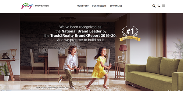
Godrej is one of India’s leading real estate companies, and its real estate web design reflects that well. The website opens with a full-screen rotating home banner showcasing spectacular visuals of projects. Awards are also highlighted in the banner to invoke trust. Textual content is sparse but impressive with clear and effective CTAs scattered all over. The website is responsive enough to adapt to all screen sizes without compromising the user experience. There’s a video at the bottom of the home page, alongside some news reports on Godrej’s recent exploits.
2. India Bulls Real Estate
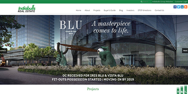
Feast your eyes on the spectacle that is India Bulls Real Estate website. It features all core components that make information accessible, easily and aesthetically. The banner features magnificent visuals of two prime projects along with catchy, industry-specific one-liners. Four projects are highlighted through some stunning photographs just below the banner. What follows is barrage of imagery featuring some awe inspiring interiors. The footer is populated by site links supplying all the information visitors require on the company, projects, and more.
3. Scot Karp
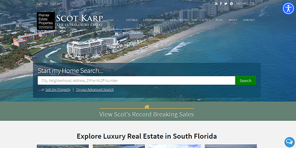
Scot Karp makes it to the list for its near-flawless web design. The website welcomes you with a delightful home banner featuring a sizeable search bar. Just punch in what you are looking for and get it at a moment’s notice. Its navigation simplified. The photographs are arresting, and impeccably placed, carrying all relevant information that the visitor might be looking for. Want to connect with Scot Karp via social media? Well, you are covered with social sharing buttons intuitively placed at top of the page, alongside a link to Scot’s record breaking sales.
4. L&T Realty
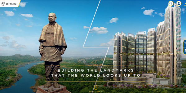
Larsen Toubro Reality is one among the best real estate websites out there. The perfect blend of aesthetics and user friendly features make the website stand out. The revolving homepage banner sits pretty on the top of the page welcoming visitors with multiple navigation tools. The ‘Connect Virtually’, ‘Project Enquiry’, and ‘Partner With Us’ buttons are located on the right side while ‘Residence’, ‘Office’, and ‘Retail’ buttons reside at lower end of the banner. It’s all about easy navigability. Just scroll down to find ‘About Us’ and ‘Awards’ sections for trust building.
5. True Homes
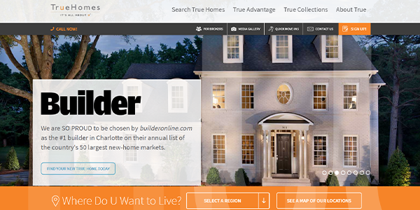
True Home Property’s core brand value is to bring top home designs, home style and new home value. The website does a good job at bringing it to the fore. Sophisticated and stylish, the site highlights what’s important – the company’s value proposition and services. A profound search bar is perched just below the homepage banner to simplify and fast-track navigation. The color scheme is good with a white background matched by blue, saffron and grey. The social media buttons are incorporated at the bottom, alongside contact information.
6. CAVU Las Vegas
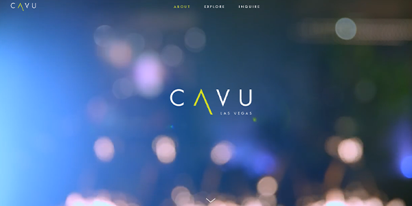
Meet CAVU Las Vegas, a single property website that hits the sweet spot between visual appeal and functionality. Featuring some breathtaking visuals, the 3D rotating homepage banner is just a precursor to an elaborate visual treat that unfolds once you scroll down. Four videos detailing CAVU’s core values and offerings are there, and so is textual content elaborating the floor plan, dimensions and other aspects of the property. The impeccably presented photographs and virtual tours offering a sneak peek into the interiors are another redeeming feature.
7. SHEERIN FEIZI GROUP
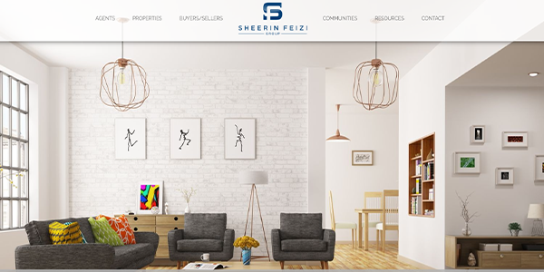
The web design company has nailed it, creating a visual delight. The edge-to-edge community photographs greet you and the animation effects ensure seamless transition while you scroll down. The color scheme is tidy, contrasted with some aesthetic imagery that fully captures the essence of Florida. From home buyers and sellers to commercial investors, the content caters to all types of audiences. The CTAs are subtle yet effective while the information delivery is intuitive. The internal linking is near-perfect with proper links provided to interior pages.
8. Cedar Bay Villas
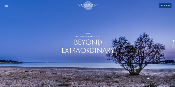
Cedar Bay Villas website represents interplay of imagery and content to keep you awe-struck. Captions like “Beyond Extraordinary” complement some stunning visuals displayed on the homepage banner to prepare you for the magic about to unfold. Just scroll down to experience seamless navigability while savoring some stunning photos and informative, sharp content. The layout is sleek, leveraging minimalist aesthetic for an intuitive user experience. Some useful info like location map, contact details, and the weather in GRAMMENO adds informative value.
9. Oxford Properties
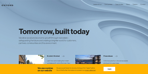
A no-frills website can be elegant and effective. Oxford Properties’ website is the right example for that. It opens with a static home page banner featuring an impressive tag line, “Tomorrow, built today”. Info on the company’s exploits, outreach, ethos, and more finds a place just below the banner, enticing visitors into investing in its brand. The website makes the most of the crisp photography, smooth and uncluttered layout, and straightforward navigation to create a brand image steeped in reliability. It’s about sending the word out with an understated simplicity.
10. PIER Commercial Real Estate
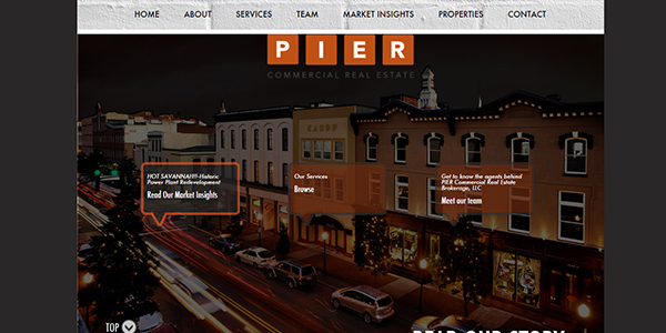
Make way for the PIER Commercial Real Estate websites, easily one among the best real estate websites out there. The web design goes beyond the norm with an impressive single-page site. Wondering how and why it works? Well, the sections are designed to appear as separate pages while layout covers your entire screen area. It adapts to any screen size – Smartphone, tabs or PCs. The color scheme is impressive and so is information delivery. From the company’s core competencies to its values, everything is well illustrated with some readable content.
For more information on real estate web development, web design, and e-commerce web design – please Click Here.